Dubai food festival’s
Beach Canteen
It all started when…
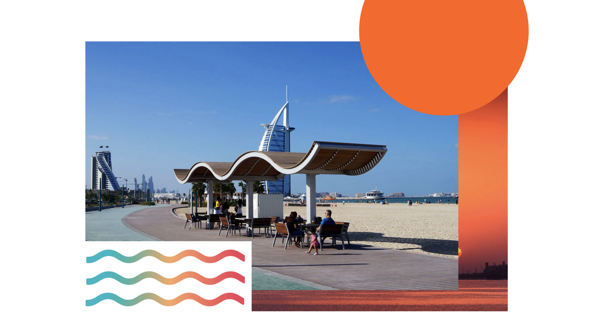
I was asked to lead a pitch to rebrand Dubai Food festival’s Beach Canteen identity. I created a fresh and modern logo and key visual. My main inspiration was Dubai being an iconic city and having some of the most stunning beaches and sunsets, which I translated into a sleek graphic and a vibrant gradient color palette. I wanted to infuse Beach Canteen with the simplicity of just being at the beach and enjoying a great time while having some great food.
This project consisted of three iterations. Each of these approaches consisted of a theme, color palette, logo lockup, key visual and variations. We started off by introducing a new approach to the brand. We won the pitch! Then, as we always did, we proceeded and I worked closely with our client to develop more options. We introduced the word Etisalat who were the main sponsors of Dubai Food Festival 2018 version. I played with colors, shapes and typography. The client chose to go with the third logo iteration, the C as wave, the wave on top of the logo was taken out and solid purple was the go to color.
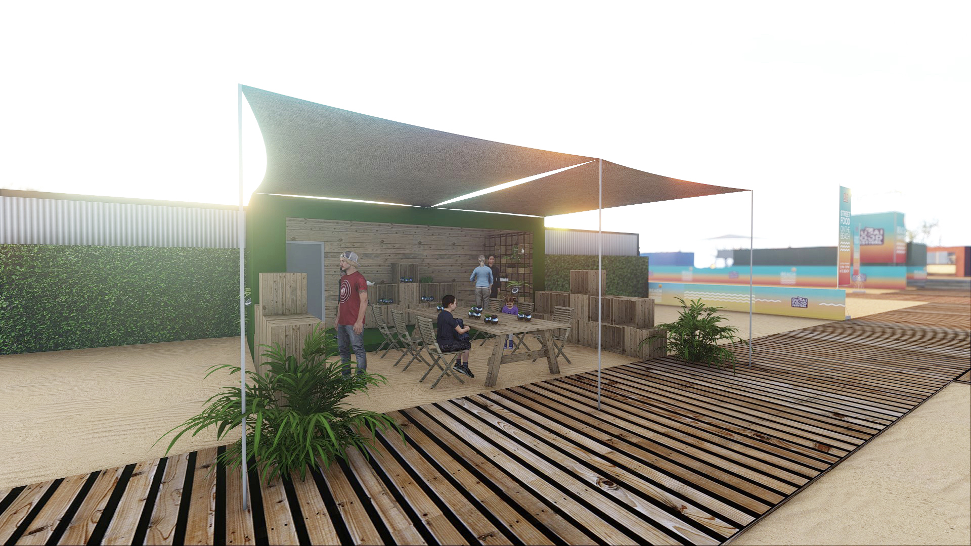
Every project is presented with a visualized and rendered three dimensional consumer journey to show the work in the grand scheme of things. For this project we only did one iteration of the renders from Round 1.
Logo, Key Visual, Branding, Renders
Color and sunset inspiration


Beach Canteen logo lockup and gradient variations
Beach Canteen color palette animation
Beach Canteen colors, logo lockup,
and the wave as a main brand element.


round 1
key visual
Beach Canteen posters
Branding collaterals and merchandise
Beach Canteen food packaging
Beach Canteen food and vendors mini brochure


Beach Canteen goes online


Beach Canteen outdoor hoarding
beach canteen in 3d
We visualized the consumer journey with different zones. STARTING AT the entrance leading to the food truck area where people will discover the latest street food trends, to retail spaces, green spaces, kids play areas, beach installations, cooking demos and a water park. Visitors will experience what fun and food at the beach feels like, with a colorful space and plenty of instagram-worthy shots!


RounD 2
Logo And Key Visual reiterations
Based on client feedback and while working closely with the DTCM team I came up with a few more options. I introduced the Wave to form the C and other letterforms and give the logo a twist. The letter C as Wave was a unique addition and a success. The client reused the same logo at the 2019 Dubai Food Festival Event. The client finally went for a solid purple color rather than gradients. The Key visuals below were also used by DTCM to promote Dubai Food Festival across many social media channels.
More key visual developments
round 3
Selected Logo and color
Credits
Art Direction l Design
Project: Beach Canteen
Company: Blink Experience 2018
Client: DTCM
Creative Director : Jeton Morina
Art Direction: Hala
Innovations Director: Oliver Wood
3D Visualization and Rendering : Eldy Tendero, Hesham Hattab
WEBSITE
Design, Copy, Animations : Hala
© 2025 HalaDesigns l hello@haladesigns.org